2021
Crafting a thoughtful, story-driven portfolio for a multifaceted artist.
Overview
Lucas, a multimedia artist with a diverse portfolio of film, photography, and design work, needed a website that presented his talents with clarity and creativity. His existing WordPress site was disjointed, leaving potential clients unsure of the full scope of his capabilities.
I designed a sleek, single-page portfolio that guides visitors through his work in a narrative-driven, visually engaging format. The result? A site that captures Lucas' artistic essence and makes it easier for clients to grasp the breadth of his skills.
WordPress
Copy
Design
Challenge
Project Background: Lucas' portfolio featured impressive work, from commercials for youth organizations to documentary filmmaking. Yet, the lack of structure on his old site diluted the impact of his diverse talents.
The Problem: Lucas needed a website that told a compelling story while organizing his varied work into digestible sections. The design had to strike a balance between creativity and clarity, helping visitors immediately understand his expertise.
Goals and Objectives:
Create a site that showcases a wide range of work without overwhelming visitors.
Use an unconventional yet user-friendly layout to reflect Lucas' artistic style.
Rewrite the bio to convey Lucas' personality and professional journey.
Optimize the site for both desktop and mobile devices.
Process and Insight
I began by conducting a content audit to identify the strongest pieces in Lucas' portfolio. The insight: Lucas' personality and approach to creativity were as compelling as his work itself. We needed to make these elements central to the site's design.
Solution
The new portfolio site uses a bold, modern structure to tell Lucas' story effectively:
Dark, Side-Navigation Layout: An unconventional menu positioned at the bottom left adds a touch of surprise and reflects his creative edge.
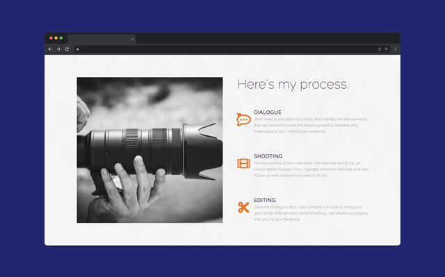
Cohesive, Story-Driven Flow: The site follows a logical progression from personal introduction to portfolio showcase, ending with a clear call to action.
Gallery-Focused Display: Projects are organized by medium, allowing visitors to explore different aspects of Lucas' work without confusion.
Personalized Copywriting: I rewrote the bio to provide a more authentic, engaging narrative that connects with potential clients.
Visual Enhancements: Stock images were thoughtfully added to complement Lucas' work and enhance the site's overall aesthetic.
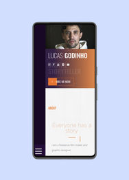
Mobile Responsiveness: The site is fully responsive, ensuring a seamless experience across devices.
Results
Lucas has a concise, creative and impressive digital portfolio that he can now use to easily and effectively put his best foot forward with potential new clients.
Stronger First Impressions: The site now reflects Lucas' artistic identity, giving visitors immediate insight into his range and expertise.
Improved Client Engagement: Clearer navigation and intuitive layout make it easier for potential clients to understand Lucas' services.
Narrative-Driven Experience: Visitors are guided through the site in a way that feels natural and engaging.
Simplified Maintenance: Lucas can easily update the site as his portfolio grows, without needing advanced technical skills.


